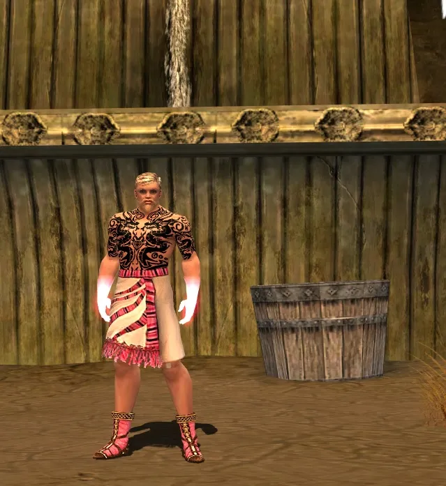
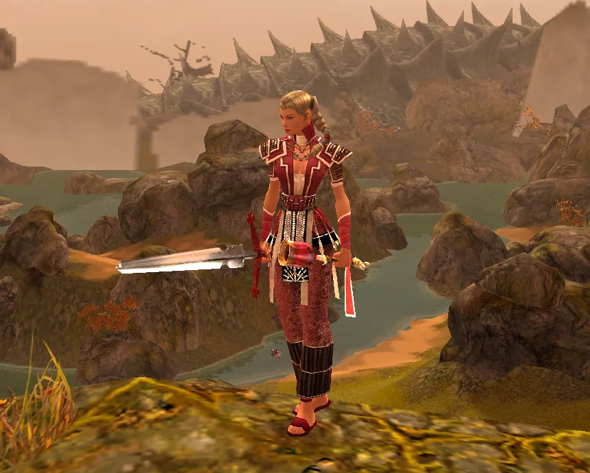
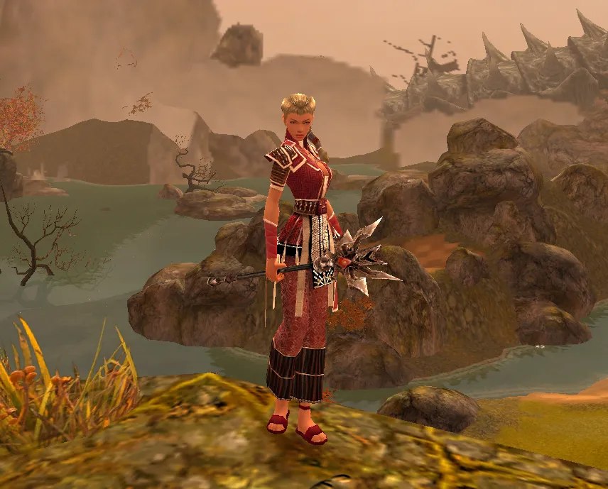
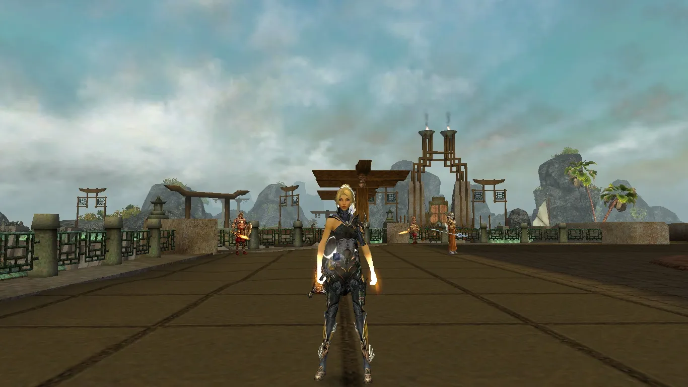
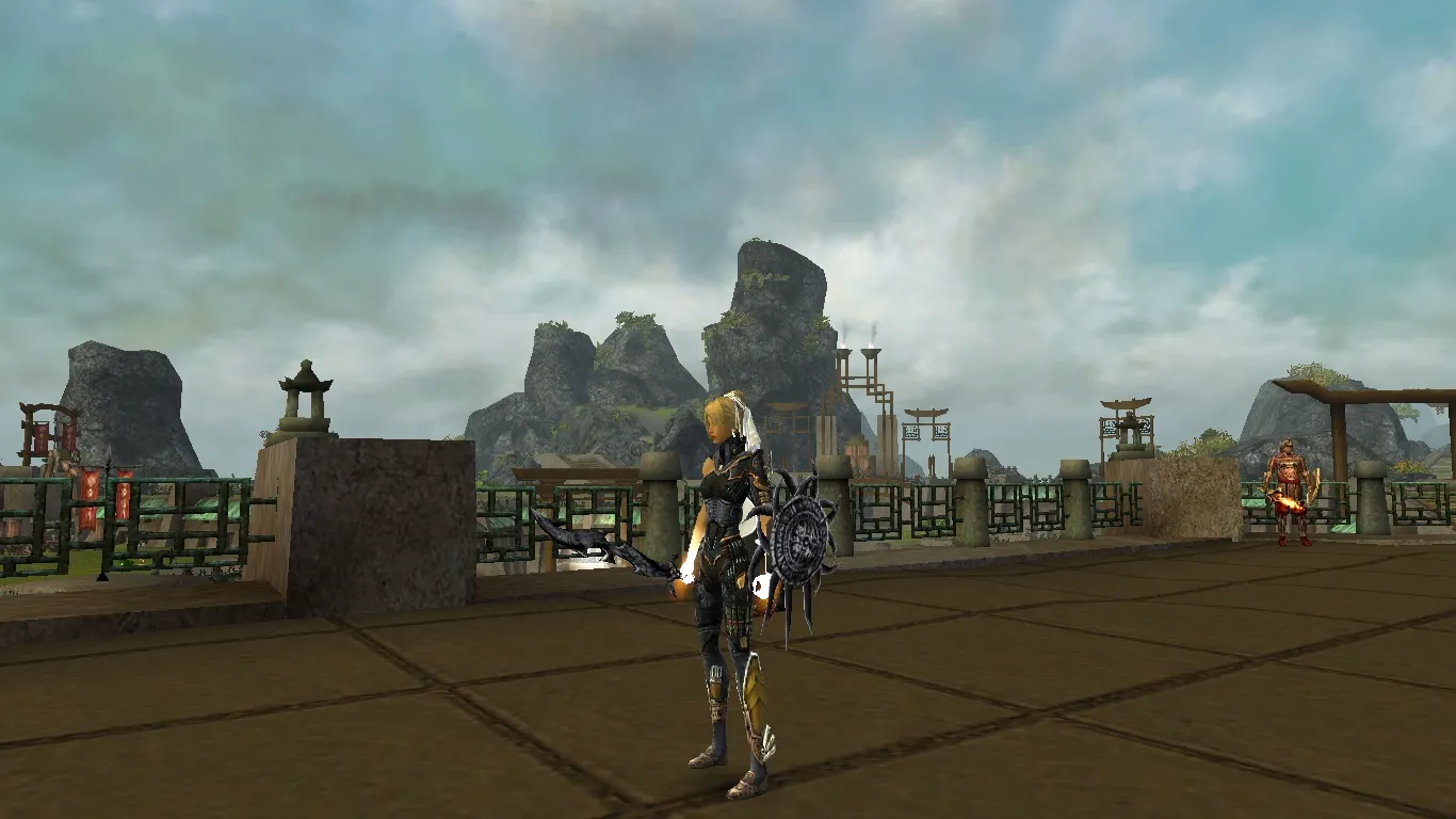
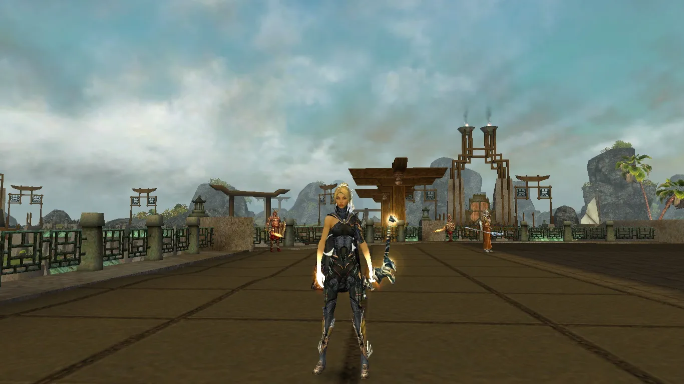
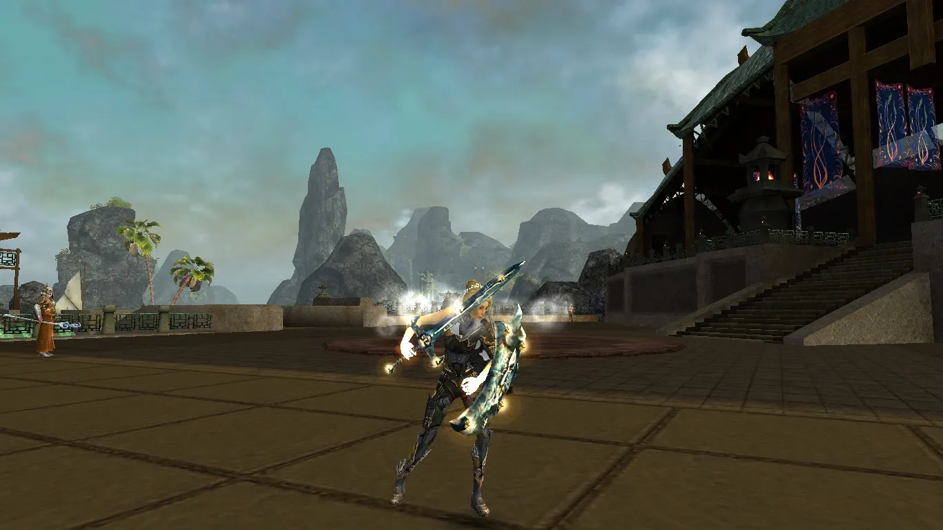
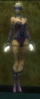
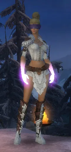
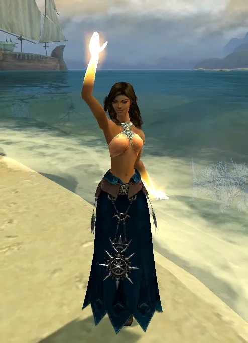
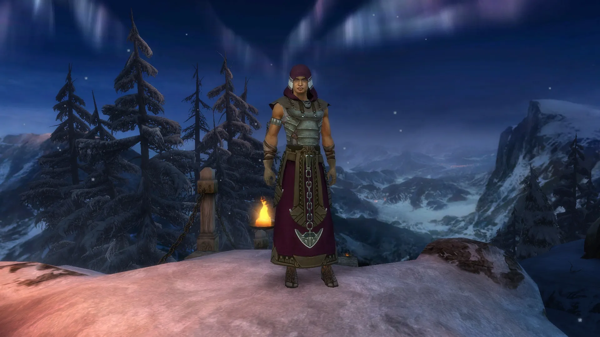
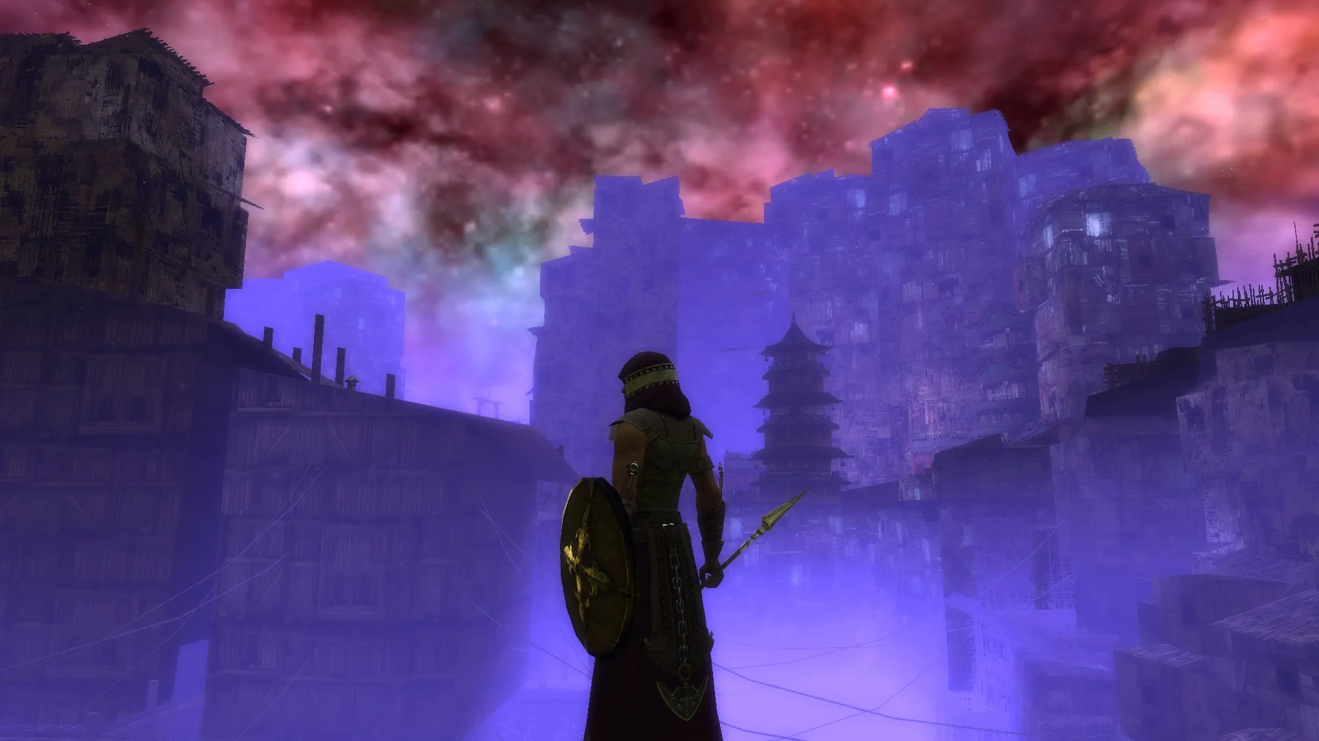
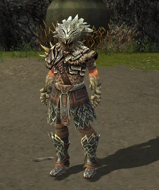
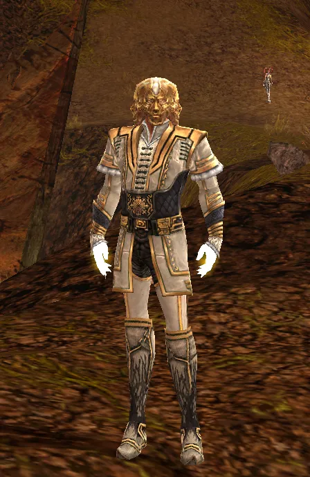
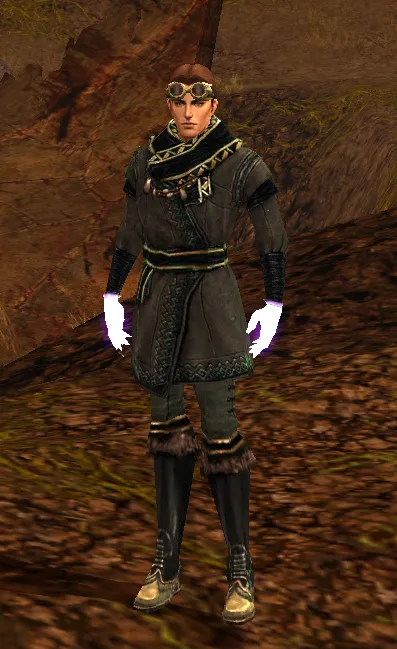
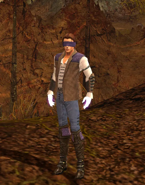
very nice one. monk looks always so comfy ![]()
Fashion Wars / Show your Character
-
-
-
dude if i was about to drown, i would rather drown then get saved by this one

still a nice combo -


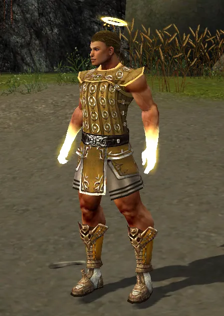
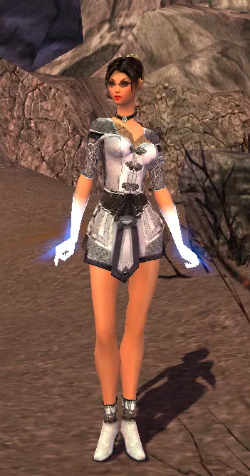
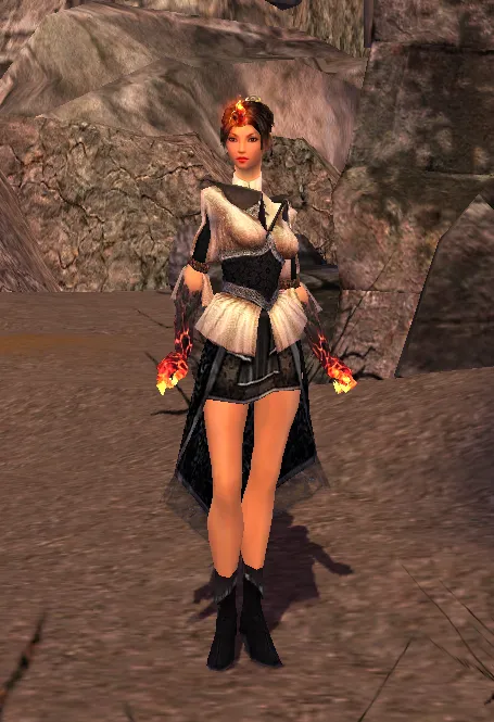
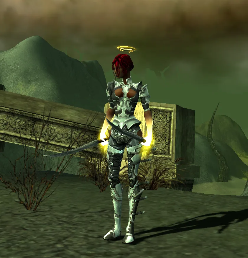
My new monk look. Imo it just looks so clean for being different pieces

Plus you can never go wrong with halo on a monky

That's damn neat !!!
-
-
-
-
That's neat !!!!
-
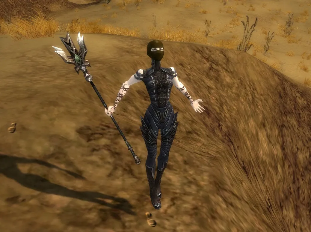
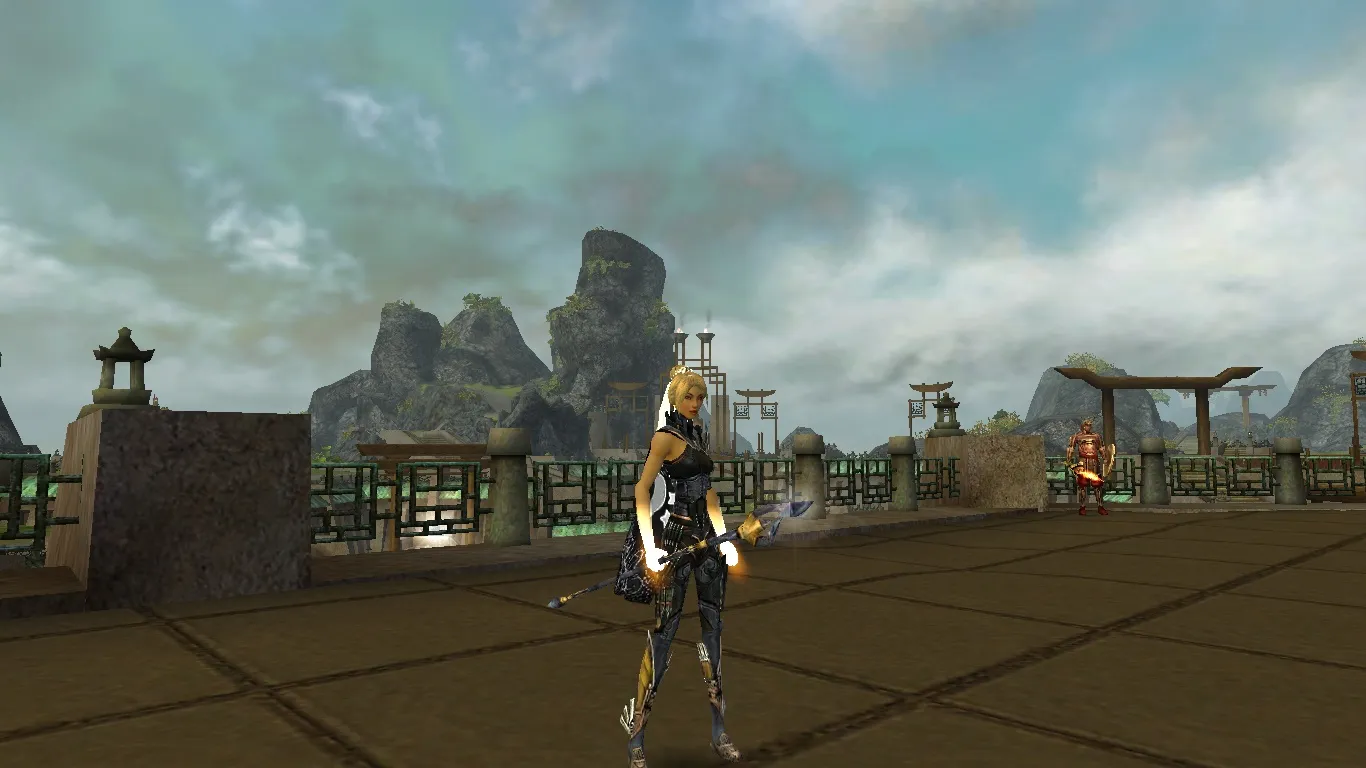
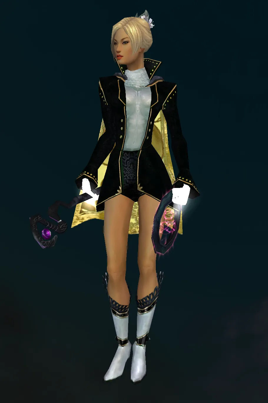
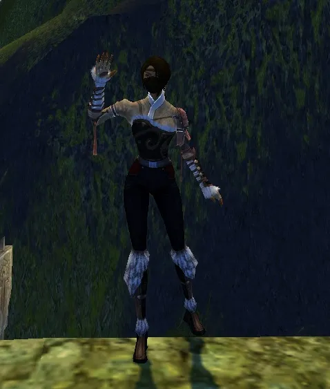
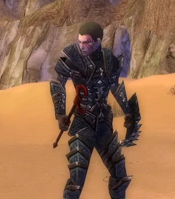
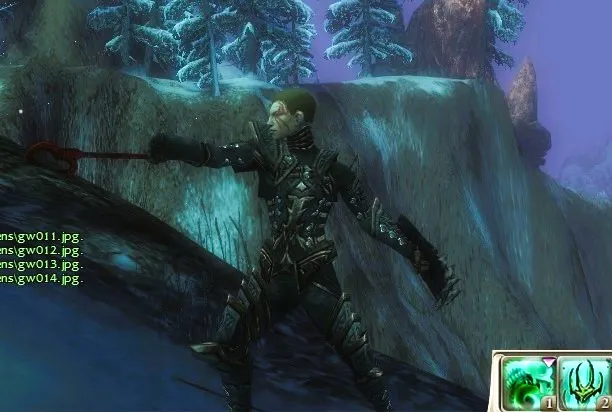
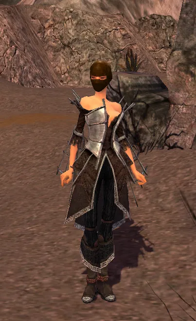
wanted to get something new for my sin:
since the obsidian Earth Staff is my fav staff skin of all, i wanted to make a look around it.
also i really love Asuran Boots so i tried to dye my armor in the same base grey/blue/silverish part of the boots, which turned out to be a really weird dye combo to get there. Added some yellow tones with the kurzick and zodiac and turned out pretty fitting imo.
PS: getting blonde hair on the Festive hat took me ages
-
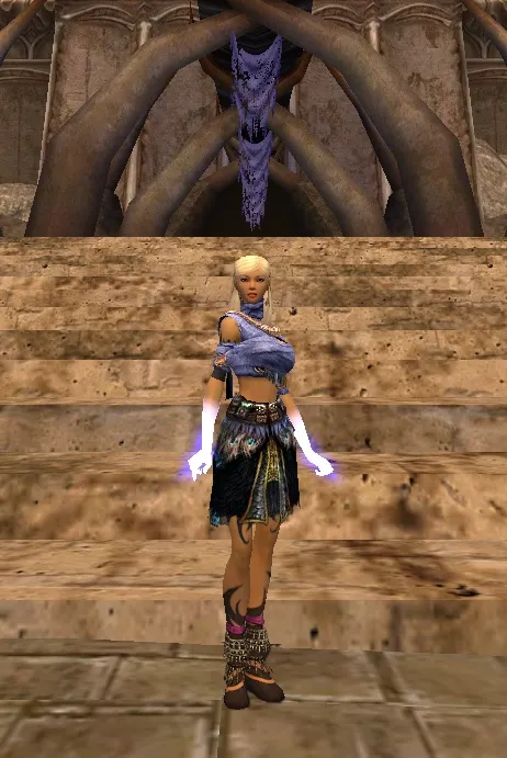
slic one.
i like the blue / greyish with the orange
looks really good -
-
-
-
your mes is missing some pants bro

but nice ones -
Combo revealed... they are actually
-
-
-
-
-
-
Display More
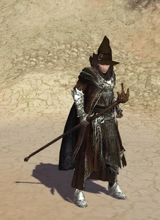
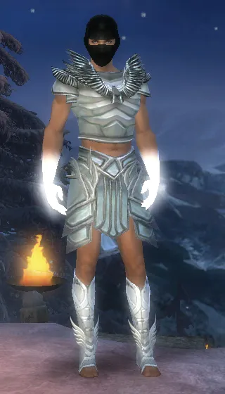
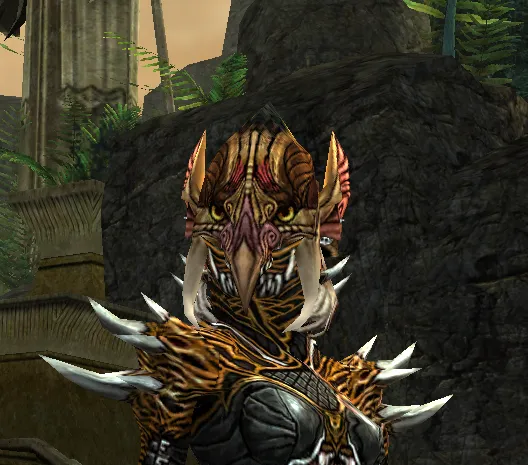
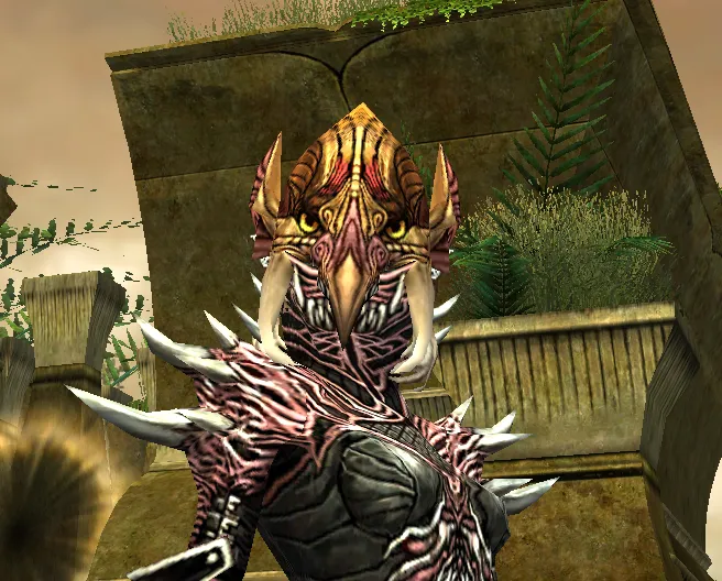
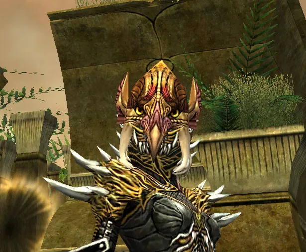
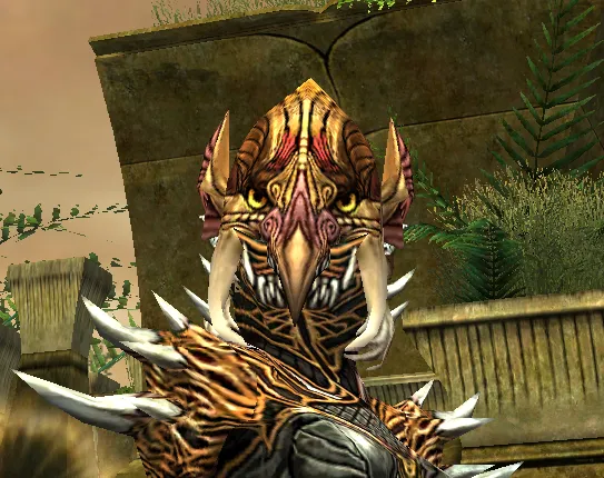
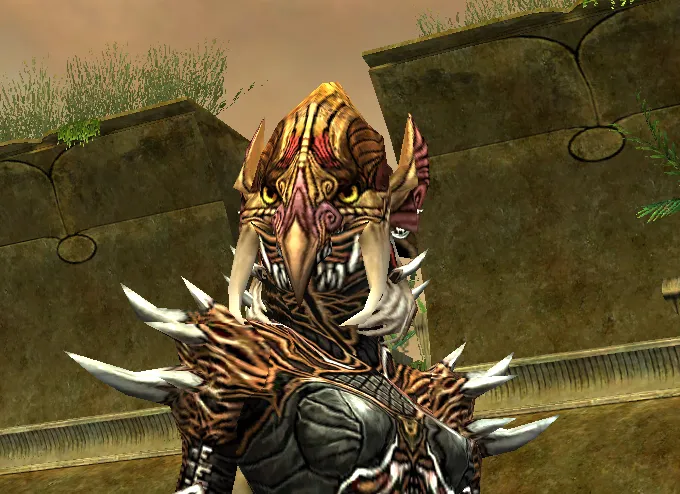
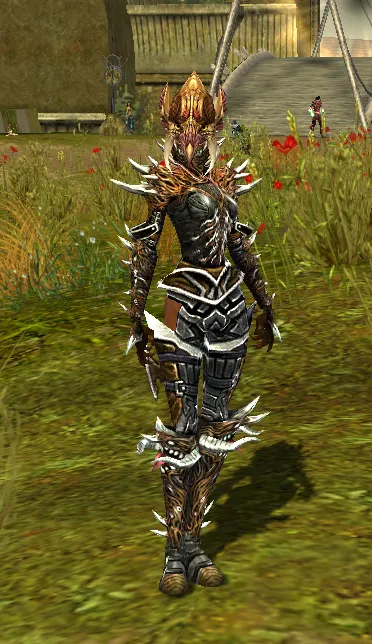
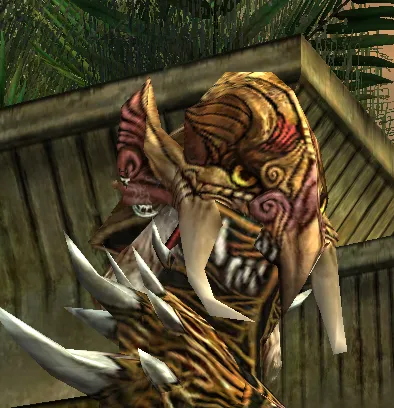
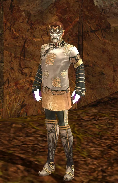
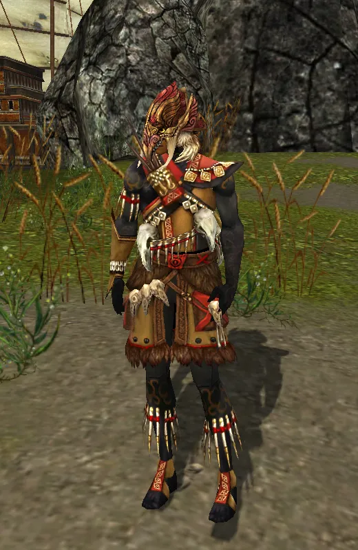
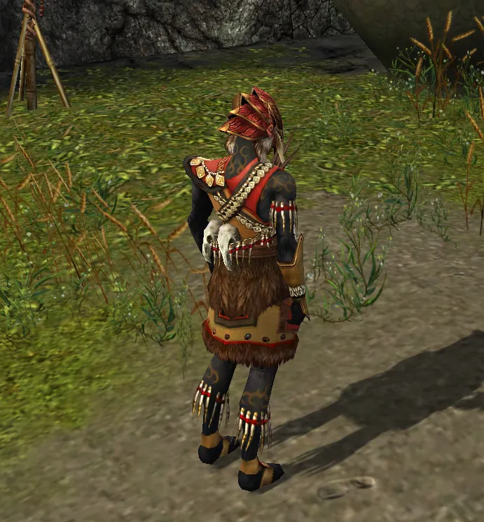
Who knew a Tengu Mask could look that good with a necro chest piece with extra neck O_o Still need to fine tune the dyes but damn

What would you suggest I dye the armor too:
1. The dark brown part on the sides
2. The light brown/gold on top
3. The pink/skin colour of the nose/ears
Sick combo
-
-
2nd one
-
-
Gentleman Xander I like the Pink one. It's amazing how it changes the perspective on the Tengu mask. In the brownish or yellow dyed versions the pink is barely visible.
I also like the brownish over the yellow but not gonna lie all versions are dope! The rest is just personal preferences I guess.
PS: the outfit might change me from Mr.Clean to Mr.StealYourLook 😜😜😜
-
Gentleman Xander i also prefer the pink one. All look dope though.
go with what you like best. -
Ostona as always sick combo :O
You figured out the fashion in this game my man -
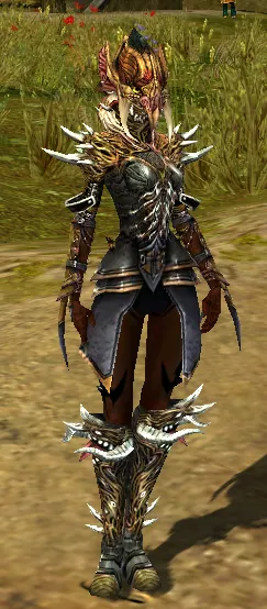
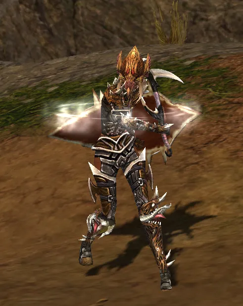
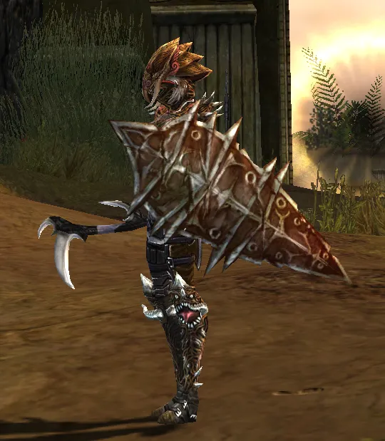
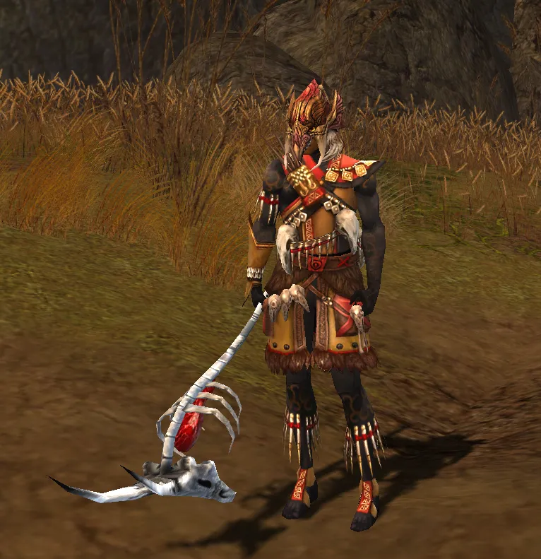
Alright I decided on the colour, changed the obby skirt for elite profane legs (since obby skirt didnt have anything silver/metal on it, it just looked weird imo). Also went out again and got elite canthan gloves too. Tried all the gloves and it was either this or Chaos, but Chaos just didnt fit as well as these did (plus they fit the theme of bones sticking out so I look like an undead tengu :3)
Edit:
You can even still see the earrings from my character going through the mask, right where the ears are, so it actually looks okay

And with weapons:)
-
Display More
Alright I decided on the colour, changed the obby skirt for elite profane legs (since obby skirt didnt have anything silver/metal on it, it just looked weird imo). Also went out again and got elite canthan gloves too. Tried all the gloves and it was either this or Chaos, but Chaos just didnt fit as well as these did (plus they fit the theme of bones sticking out so I look like an undead tengu :3)
Edit:
You can even still see the earrings from my character going through the mask, right where the ears are, so it actually looks okay

And with weapons:)
This would literally be a hit at Paris fashion week
-
-
-
very lovely
-
Tips for getting high quality screenshots?
-
Tips for getting high quality screenshots?
4K screen, using GW Toolbox with the /camera unlock command and /cam speed 99 to go slow, with the interface clean (Control + H) with this settings: https://imgur.com/a/hR5VMx8
Once I have the raw screenshots, I edit them in Photoshop in this order:
- I fix the background light adding +10 points in Blue inside the Color Balance submenu (Control + B).
- I normally add +10 or +20 points in brightness (Image > Adjustments > Brightness) depending the situation.
- I sharp the pictures with 2 options, "Sharpen" or "Unsharp Mask" depending the situation (in the submenu Filter > Sharpen).
- And sometimes: when an image has a lot of light in the raw screenshot, what I do is overlay a copy of the original. On the top layer I keep the modification with increased light, on the bottom layer I keep the original screenshot, and then I delete the remains of burned light from the top layer with the Eraser Tool (setting the Hardness between 0% ~ 20%), so the final photo keeps the augmented clarity but without burned parts.
-
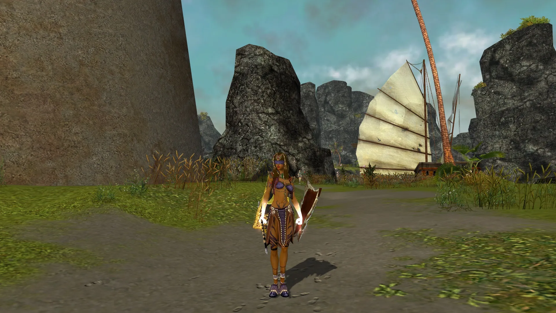
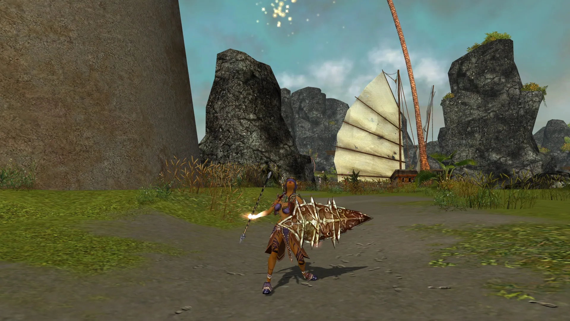
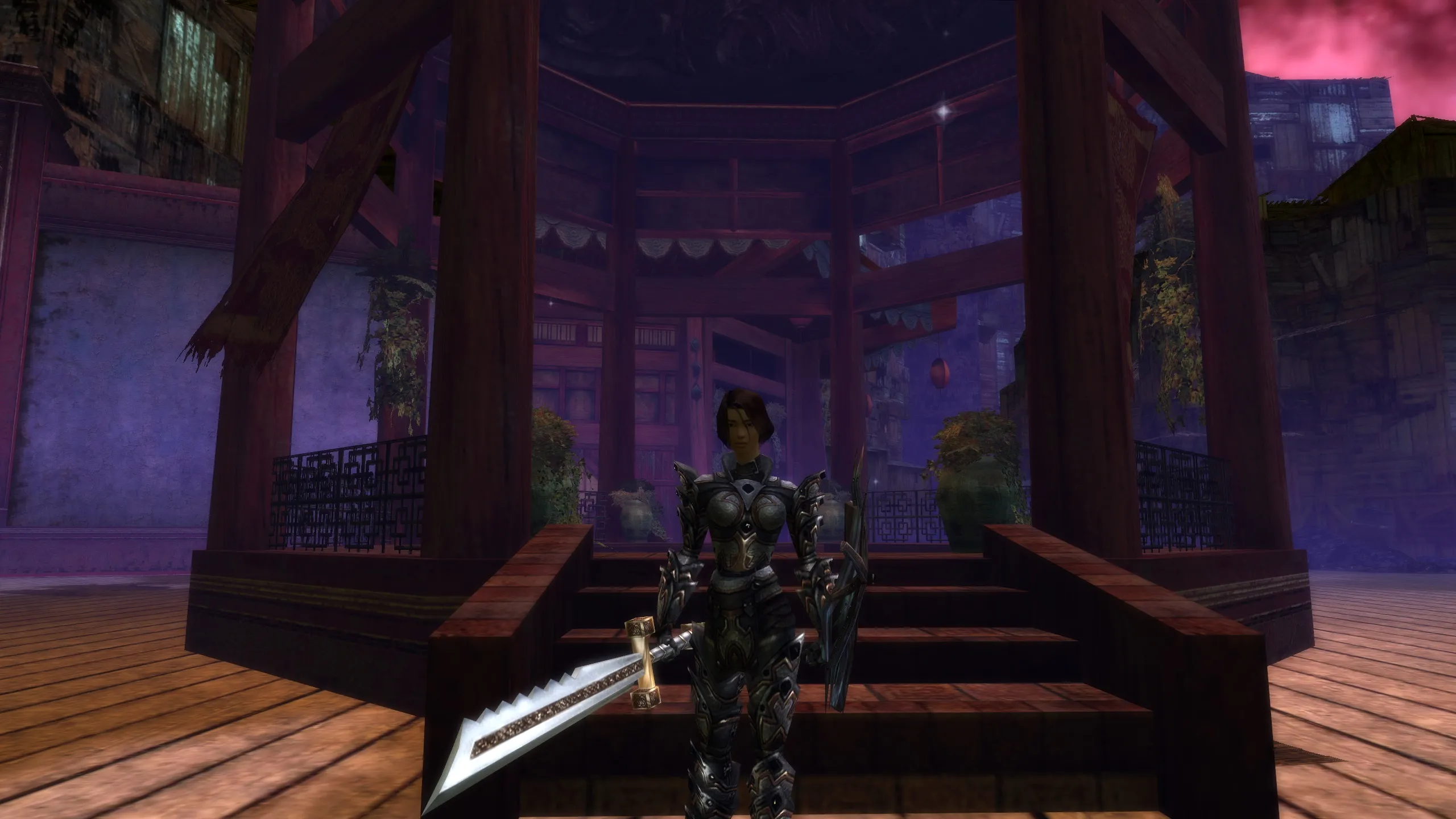
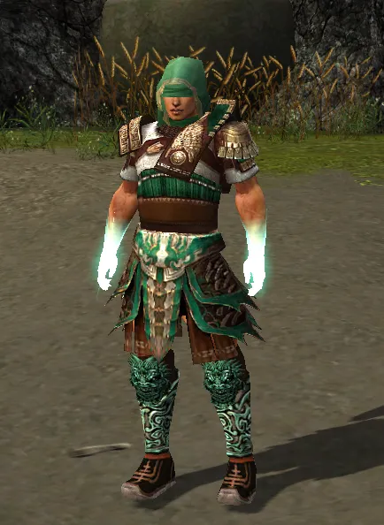
Decided to get my Warrior a new outfit, not sure yet about which one I like the most but here is what I tried so far:
Option 1: Divine Warrior
Option 2: Kormir's Number one
Option 3: Charr - Grasping Half Blood (before any says the dyes on the legs/boots don't really match, this is the best it gets at Brown/Red/White/White everything else didnt come any closer QQ)
-
-
-
-
-
Looks dope and very metal/assa styled. But no chaosgloves Elite kabal gloves pweeease🙏 they would add another blade 🔪 😜
-


