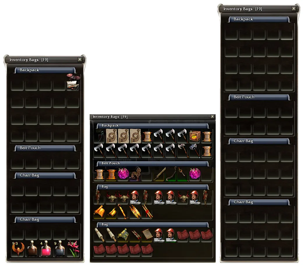
So the cupcakes were delivered to Anet today and Bill Freist surprised us with an image of a storage update.
https://www.reddit.com/r/GuildWars/co…in_a_few_hours/
I'm happy/grateful for extra inventory space but my nitpick was with the appearance. I'm not sure if that's just for testing purposes, but it ruins the look of the inventory I'm used to. Picky, I know...

The one on the left is the original, the middle is the WIP, and the one on the right is cobbled together in PS to represent what I think the final product should look like. Am I alone on this?

